
Color Theory for Controlled Improv

A number of you messaged and asked me to record the Color Theory Demo I did over and over at QuiltCon 2022 in Pheonix a couple of weeks ago. It was hard to record and see in the space, so I decided to go a step farther and actually provide you with a full tutorial of the process.
The First Time I Tired Improv Quilting was a Disaster
The first time - let’s be honest, the first couple times - I tried improv quilting it was a disaster. I was told to, “just start with no plan and keep adding to it and it will be glorious.” Okay, maybe they didn’t use the word glorious, but quilty friends, each was a serious disaster. There was nothing glorious about it. I know I tried a number of times, and each time I did, I ended up throwing away the project and feeling guilty for wasting time and fabric.
Now, looking back, I consider it all “tuition” for developing my own method of what I have come to call “controlled improv.” When I use this term, what I mean is that by applying design elements found in nature to the “boundaries” or “parameters” I intend to work inside for the improv piece, I end up with a quilt that my brain sees as natural, normal, or coordinated. So, maybe I don’t have an actual plan, but I do have boundaries. The first boundary to consider for me is always color.
This post includes tips and images to help guide you through making color decisions for your controlled improv quilts. This is great for any of my patterns like All the Good, Golden Eye, and Caper. It also works if you’d like to design your own.

Starting with Some Fabrics
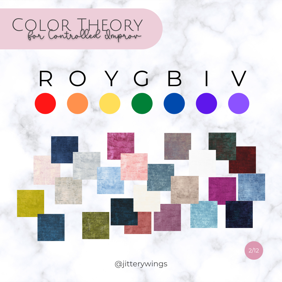
In the image above (1/12) I have a random selection of 24 fabrics from Jennifer Sampou’s Chalk & Charcoal line with Robert Kaufman. I will actually be working with these fabrics for my next Caper Quilt and through this tutorial will show you how I decide the order of my fabrics so there will be a flow and a natural gradient to the final quilt.
Step 1: Begin by just laying all the fabrics out so you can see them which is what I did in image 1/12. They will not look right. At this point, don’t try to get them in any sort of order - simply lay them all out so you can see them.
TIP 1: Either snip a little corner from each fabric so you can easily move them around or if you are using fat quarters or something smaller fold them all to a similar size.
TIP 2: It is helpful to lay your fabrics on something white so the background doesn’t alter the appearance of the fabric color. You need a space large enough to move the fabrics around.
Color Confessions + ROY G BIV
Okay friends, total confession. I spent a long time avoiding the color wheel because I didn’t understand it. All that monochromatic, analogous, complementary, triad, split complementary, and tetradic never made sense to me - I think because I could never see the colors on the wheel next to each other - I am honestly not sure why, but I still avoid it to this day.
Think of Color in a Line
Instead of the color wheel, I like to think about color in a line that represents the rainbow. Most of us learned ROY G BIV in grade school. It stands for red, orange, yellow, green, blue, indigo, and violet. This is something that occurs in nature again and again, so our brains recognize a rainbow as natural.
Step 2: Determine a space on your table where each of these colors may be placed in order of ROY G BIV. Then, as shown in the image below, begin making little piles of fabrics by the color of the rainbow. If you have neutrals like whites, browns, greys, or blacks, hold them until later. This is shown in the image below (3/12). The grey circle to the side holds my neutrals. It also holds my “hot pinks.” I will talk about those below.

Making a ROY G BIV Line Into a Color Wheel
If you take a line of ROY G BIV and circle it around it is the color wheel. If you overlap the edges of colors that are next to each other you get different tones and saturations. This will be important for Step 3. The image below (4/12) shows what happens when you overlap the colors.

Where the Color Wheel Meets
Looking at the image below, you can see where the “hot pinks” go when you realize that the reds (at the start) and violets (at the end) come together when you circle the color wheel around on itself. I still find it simpler to think of it in a straight line, so I used arrows below to show them coming together on either end. See image (5/12) below.

The image below (6/12) shows what it looks like to place your fabric colors in a color wheel.
NOTE: It doesn’t matter how many of the colors on the wheel are represented. Once you begin to place them on the line/circle, your brain should begin to recognize them as more natural. They should “feel better” to you instantly. Maybe not perfect, but definitely better than when they were just all laying out on the table in no apparent order.
TIP 3: Where two colors overlap, you may have enough fabric for that to be its own color group in your palette. As an example, I have a yellow and a dark green below. I also have a sorta yellow-green that I placed between the two.

The Next Natural Design Element
The next natural design element I like to use when thinking about color theory is moving from color to color in a light to dark - dark to light - light to dark - dark to light pattern.
Step 4: Thinking of your colors individually as “clumps,” within each clump, begin lining them up from light to dark and then dark to light.
Step 5: After you have each color in a light to dark order, take your first color and lay it out from light to dark. Then take the next color clump in your palette are reverse it. Lay it out from dark to light. Then the third goes light to dark. You repeat this all the way to the end of the line. This is shown in the image below (7/12).
THE GOAL: The goal is that you don’t have “harsh” transitions with a very dark fabric and a very light fabric right next to each other. That is fine for a lot of quilts, but for a quilt with a lot of color and flow, it is disruptive to the eye.
TIP 4: After getting started, you may realize you only have a single fabric of one color and it is light. That means that the color before it must “end” in light, and the color that comes after it must “start” in light.

Adding Neutral Fabrics & Breaking Your Line
In a quilt design that needs a gradient of color, you don’t always have to start with R (red). You can actually “circle” your line around so that your colors are all in order of the color wheel and then you break it at any point to begin.
The same is true for where you add your neutrals. I personally like to keep my neutrals all together in a light to dark order also.
Step 6: Decide which color you want to start the flow of your ROY G BIV and then “break” the circle and straighten all your colors out into a line, keeping them in order.

Step 7: Decide where in your line the neutrals will be placed. I tend to like them in the center, but off-set from the center. They need to flow through your light to dark, dark to light pattern without disrupting the eye.
TIP 4: Most neutrals have a hit of one of the ROY G BIV colors in them. In my palette, they are mostly hits of Red. If that is the case, it will be important to keep them close to that primary color so your brain reads them as natural.

In My Example
Using my current palette, in a reverse ROY G BIV, I have established the following color line to create a natural flow in my quilt.

In Case You Were Wondering
This is a list of the 24 fabrics I used in this sample from Jennifer Sampou’s Chalk & Charcoal line with Robert Kaufman. They are laid out with the color name, but the arrows show the flow of ROY G BIV I landed on.
These fabrics and this color combination will work lovely with any of my Controlled Improv Patterns, including, All the Good, Golden Eye, and Caper.

You Can Do This
You can do this. Just take your time, and lay your fabrics out while following the tutorial. You Got This!

